
Design Philosophy
Developer tools need to feel powerful without being intimidating, and technical without feeling cold. We started by watching how developers used documentation and dashboards. It was clear from the start that they didn’t want decoration. They wanted clarity.
So the system had three jobs: make abstract data easy to see, earn developers’ trust, and hold together across the product, docs, and marketing.
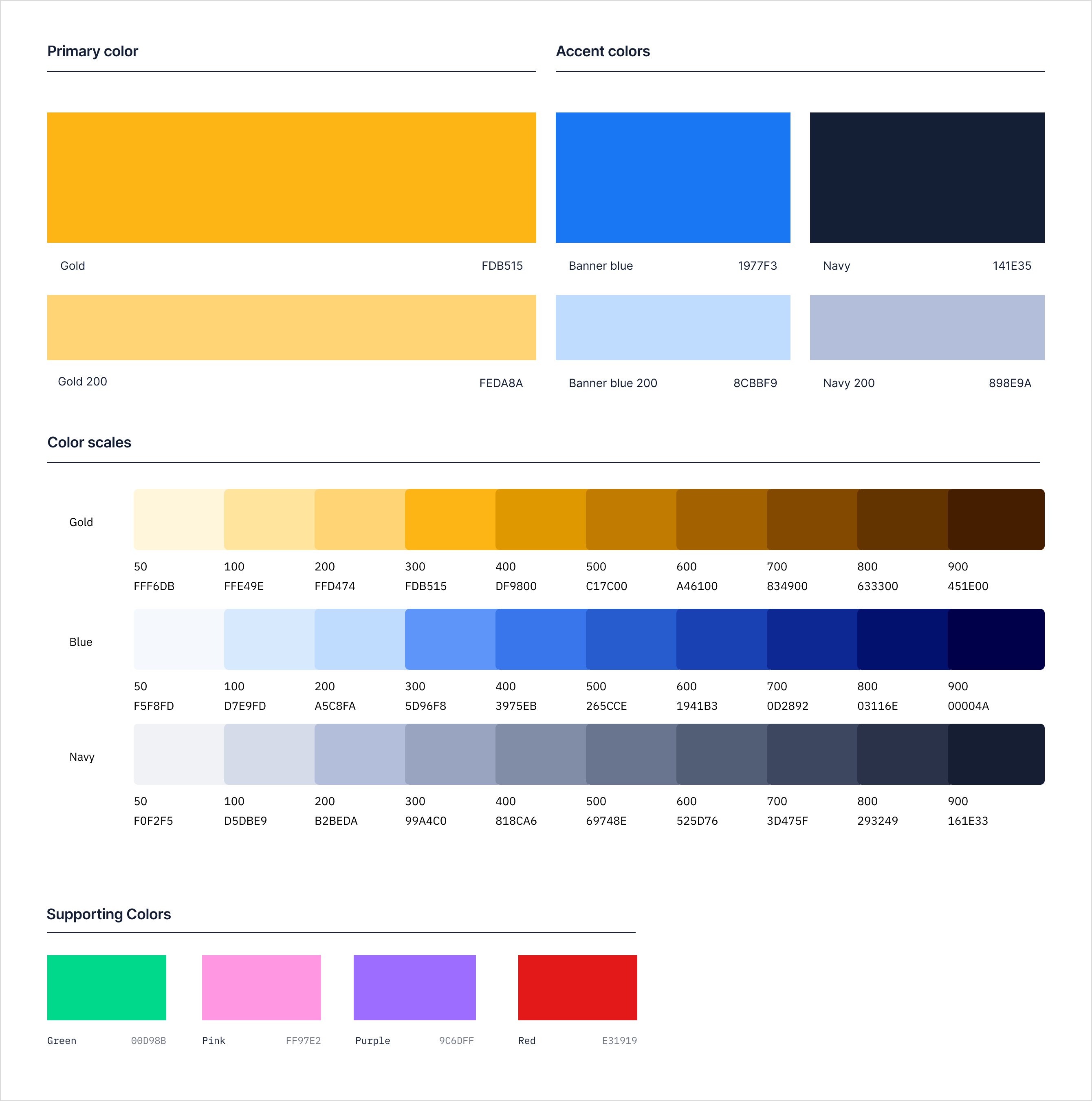
The color palette came first. It needed strong contrast so it was easy to read, and enough range to work in charts. Gold gave the brand warmth while staying professional. Blue and navy made it feel technical. Lighter and darker shades of each covered everything the interface needed, like hover, disabled, and error states.
Interface & Workflow
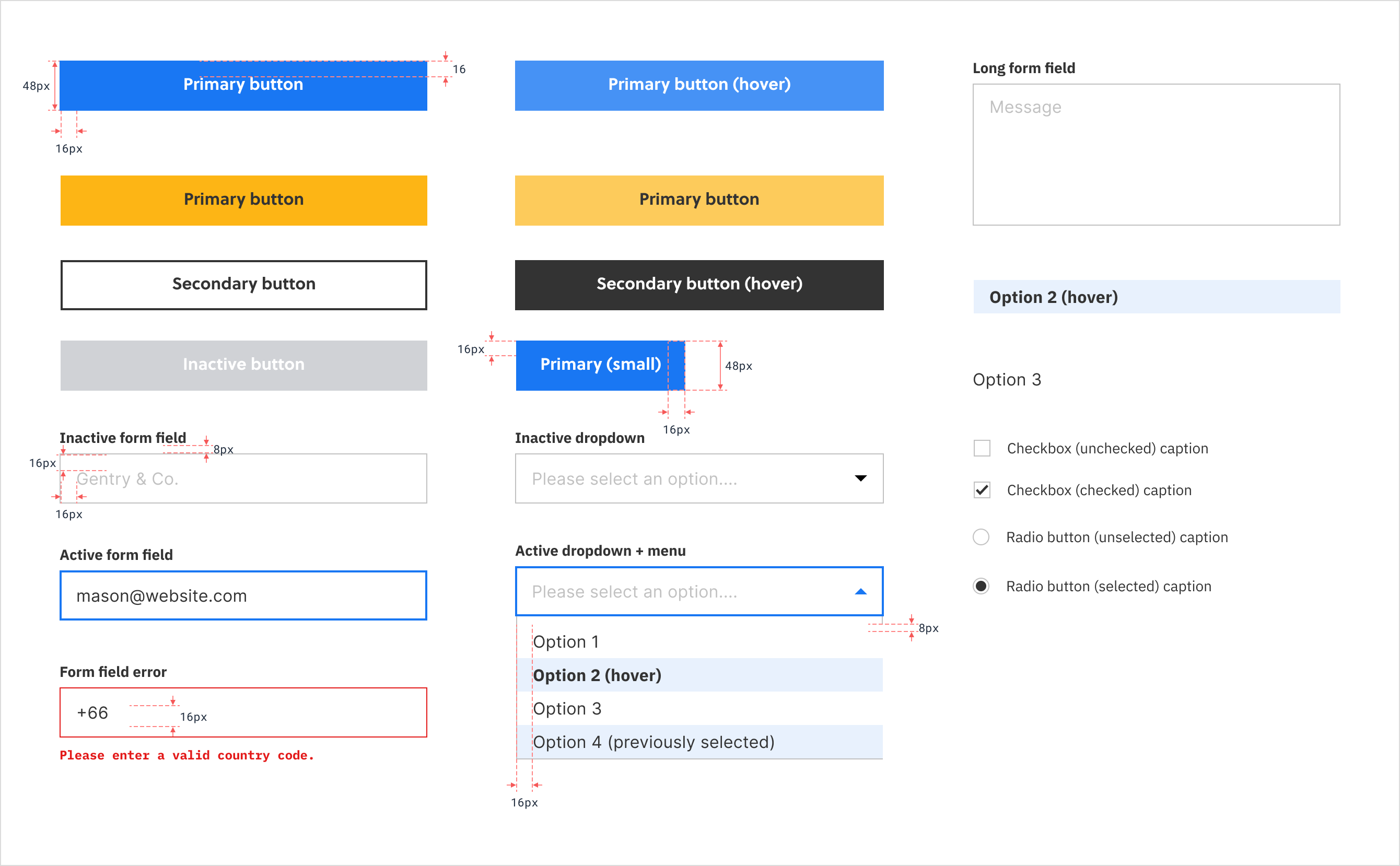
Every UI element supported the developer workflow. Form fields, buttons, and interactive states followed familiar patterns while maintaining a distinct point of view. We prioritized high density layouts and clear feedback loops, ensuring that even as data complexity scaled, the interface remained predictable. Spacing was precise and nothing was decorative.
Consistency Across the Experience
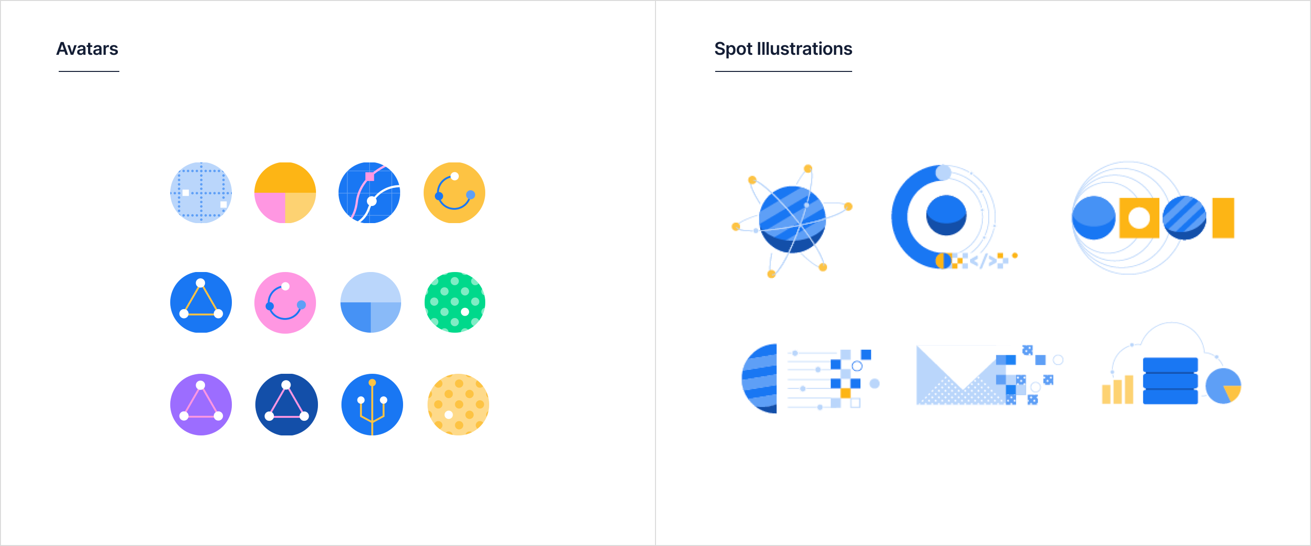
Avatars and spot illustrations extended this system across the entire journey. They maintained a consistent voice while adapting to different contexts, from the product experience to brand marketing.
Bringing Technical Flow to Life
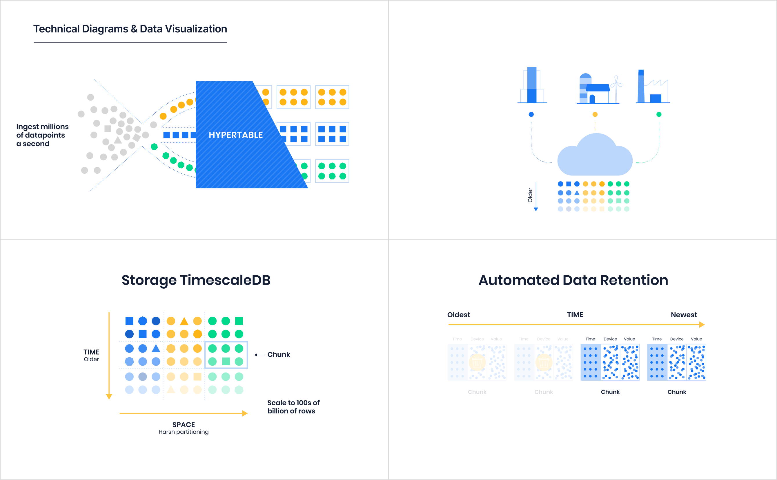
Our illustration style turned abstract concepts into tangible ideas. We transformed hypertables, data retention, and time series architecture into dynamic visual narratives rather than documentation hurdles. This approach helped make the inner workings of the database visible and intuitive.
Visualizing the Stack
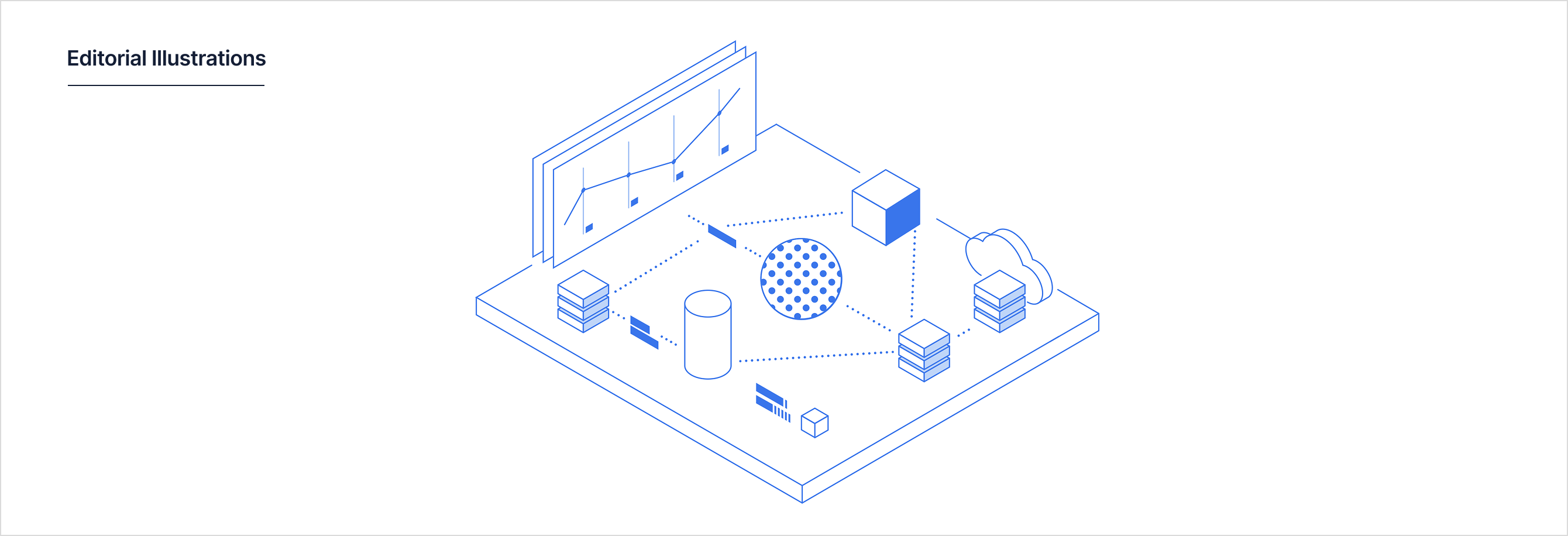
To support the content strategy, we created a suite of editorial illustrations designed specifically for engineering and product blog posts. These assets translated complex backend concepts like time series data, cloud partitioning, and distributed nodes into a visual language that guided the reader through the articles.
Results
The comprehensive design system successfully moved the brand away from generic stock imagery toward a custom visual identity. By establishing a modular framework, we created a scalable library of assets that unified the product experience.
The result was a design system that felt like it was built by people who actually used databases.
- Role
- Design lead
- Team
- Me, plus a designer, an illustrator, and an icon designer
- Shipped
- Timescale’s product, docs, and marketing
- Outcome
- Replaced stock imagery with a custom visual identity