Don’t use pure black in your headlines
When you sit down to design a website, it’s tempting to pick black (#000) for your headlines and body copy and be done with it. Resist this urge! Pure black copy on a white background is too jaring. Try a dark gray instead. Most big companies do this…
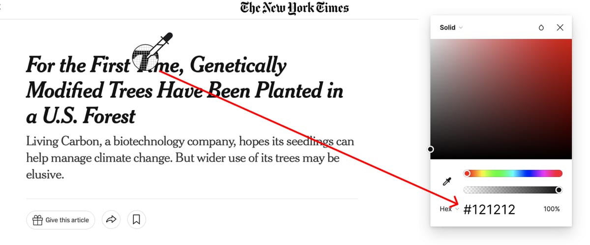
The New York Times uses #121212:
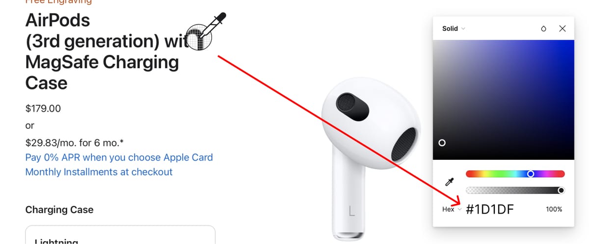
(H3)Apple uses #1D1DF:
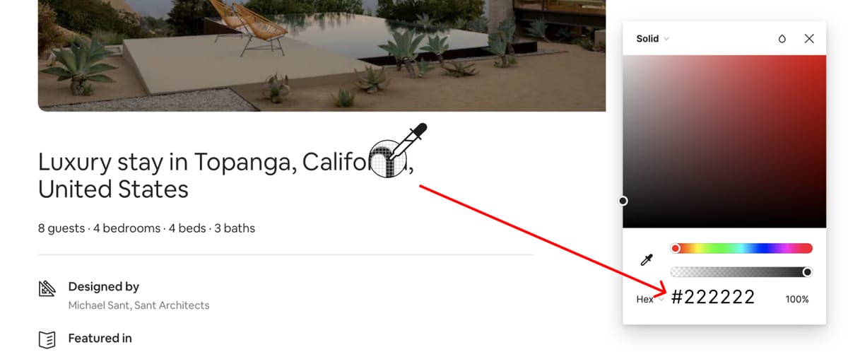
(H4)TAirbnb uses #222222:
Tip:
Sometimes I’ll sample a color in my color palette and slowwwly add black to it. Then I’ll use that new color for all my headlines and body copy. This makes the color palette and copy more visually cohesive. Here's an example: